「兔了个兔」纯 CSS 制作兔子、气球动画
介绍
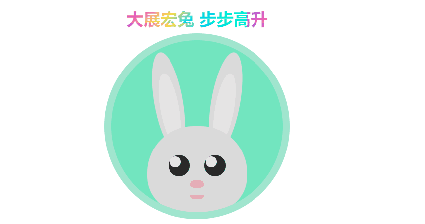
Hello,掘友们好!又是一年新春之际,祝福大家兔年快乐!下面我们使用纯 CSS 制作一个兔子、气球动画,效果为:一个圆形框内有只兔子,当我们在光标悬停在圆形框内或通过键盘 Tab 键导航来聚焦到圆形框元素时,小兔子将张大嘴巴,同时底部升起三只不同颜色的气球,上面的祝福语也会开启颜色动画,这个动效意味着掘友们能在新年大展宏图、步步高升。效果如下:
实现
- 创建一个容器元素。
<div class="container" tabindex="0"></div>
设置 tabindex="0",表示该容器元素是可聚焦的,并且可以通过键盘 Tab 键导航来聚焦到该元素。
- 创建顶部祝福语元素。
<div class="prompt">大展宏兔 步步高升</div>
由于是在容器元素状态变化时,改变祝福语元素的状态,所以可以使用相邻兄弟选择器 +,且要将它们 position 属性设置为 absolute,从而将容器元素排在后面显示。祝福语元素的动画状态默认 paused,当容器元素 hover 和 focus 时,动画状态变为 running。
div {
  position: absolute;
}
.prompt {
  top: 0;
  left: 0;
  right: 0;
  margin: 0 auto;
  text-align: center;
  padding: 1em;
  font-size: calc(1em + 1.5vw);
  font-weight: bold;
  background: linear-gradient(150deg, #9b5de5 0%, #f15bb5 20%, #fee440 40%, #00bbf9 60%, #00f5d4 80%);
  background-size: 20% 20%;
  background-color: #840b2a;
  -webkit-background-clip: text;
  -webkit-text-fill-color: transparent;
  animation: gradient 5s linear infinite paused;
}
@keyframes gradient {
  0% {
    background-position: 0% 0%;
  }
  50% {
    background-position: 50% 50%;
  }
  100% {
    background-position: 100% 100%;
  }
}
.container {
  top: 6em;
  bottom: 0;
  left: 0;
  right: 0;
  margin: 0 auto;
  width: 24em;
  height: 24em;
  background: aquamarine;
  border-radius: 50%;
  border: 1em solid #b2ffe5;
  overflow: hidden;
  filter: brightness(.9);
}
.container:hover+.prompt, .container:focus+.prompt {
  animation-play-state: running;
}
- 创建兔子身体各个位置的元素。
<!-- 身体 -->
<div class="body">
  <!-- 眼睛 -->
  <div class="eye left">
    <div class="shine"></div>
  </div>
  <div class="eye right">
    <div class="shine"></div>
  </div>
  <!-- 鼻子 -->
  <div class="nose"></div>
  <!-- 嘴巴 -->
  <div class="mouth"></div>
</div>
<!-- 耳朵 -->
<div class="ear-left">
  <div class="inner-ear-left"></div>
</div>
<div class="ear-right">
  <div class="inner-ear-right"></div>
</div>
设置兔子身体各个位置的元素样式,当容器元素 hover 和 focus 时,设置嘴巴元素高度变化。
.body {
  top: 12em;
  bottom: 0;
  left: 0;
  right: 0;
  margin: 0 auto;
  width: 14em;
  height: 12em;
  border-radius: 6.5em 6.5em 5em 5em;
  background: #F2F2F2;
  z-index: 50;
}
.eye {
  top: 4em;
  width: 3em;
  height: 3em;
  background: #2E2E2E;
  border-radius: 50%;
  z-index: 100;
}
.left {
  left: 3em;
}
.right {
  right: 3em;
}
.shine {
  top: 0.22em;
  left: 0.22em;
  width: 1.5em;
  height: 1.5em;
  border-radius: 50%;
  background: white;
}
.nose {
  left: 0;
  right: 0;
  margin: 0 auto;
  top: 7.5em;
  width: 1.9em;
  height: 1.1em;
  border-radius: 50% 50% 35% 35%;
  background: pink;
  z-index: 960;
}
.mouth {
  z-index: 950;
}
.mouth-left {
  background: #fff;
  width: 2.6em;
  height: 2em;
  border-radius: 50%;
  top: 7.8em;
  left: 4.7em;
}
.mouth-right {
  background: #fff;
  width: 2.6em;
  height: 2em;
  border-radius: 50%;
  top: 7.8em;
  left: 6.7em;
}
.ear-left {
  background: #F2F2F2;
  height: 14em;
  width: 4em;
  border-radius: 50%;
  left: 6em;
  top: 1.6em;
  transform: rotate(-10deg);
  z-index: 10;
}
.inner-ear-left {
  left: 0;
  right: 0;
  margin: 0 auto;
  background: #fff;
  height: 10em;
  width: 2.6em;
  border-radius: 50%;
  top: 3em;
}
.ear-right {
  background: #F2F2F2;
  height: 14em;
  width: 4em;
  border-radius: 50%;
  right: 6em;
  top: 1.6em;
  transform: rotate(10deg);
  z-index: 10;
}
.inner-ear-right {
  left: 0;
  right: 0;
  margin: 0 auto;
  background: #fff;
  height: 10em;
  width: 2.6em;
  border-radius: 50%;
  top: 3em;
}
.mouth {
  top: 9.6em;
  left: 0;
  right: 0;
  margin: 0 auto;
  border-radius: 0 0 5em 5em;
  width: 2em;
  height: .6em;
  background: pink;
  z-index: 900;
  transition: height 500ms ease-in-out;
}
.container:hover, .container:focus {
  filter: brightness(1);
  outline: 0;
}
.container:hover>.body>.mouth, .container:focus>.body>.mouth {
  height: 1.6em;
}
- 创建各个气球元素。
<div class="balloon-1">
  <div class="inner-balloon-1"></div>
  <div class="knot-1"></div>
  <div class="line-1"></div>
</div>
<div class="balloon-2">
  <div class="inner-balloon-2"></div>
  <div class="knot-2"></div>
  <div class="line-2"></div>
</div>
<div class="balloon-3">
  <div class="inner-balloon-3"></div>
  <div class="knot-3"></div>
  <div class="line-3"></div>
</div>
设置各个气球元素样式,当容器元素 hover 和 focus 时,开启气球从底部升起动画。
.balloon-1 {
  background: red;
  width: 6.6em;
  height: 8em;
  left: 2em;
  top: 24em;
  border-radius: 50%;
  z-index: 0;
}
.inner-balloon-1 {
  background: white;
  opacity: 0.3;
  width: 5.6em;
  height: 7em;
  left: 0em;
  top: 0em;
  border-radius: 50%;
}
.knot-1 {
  background: red;
  clip-path: polygon(50% 0%, 0% 100%, 100% 100%);
  width: 1em;
  height: 1em;
  top: 7.6em;
  left: 0;
  right: 0;
  margin: 0 auto;
}
.line-1 {
  width: 1px;
  height: 6em;
  background: grey;
  top: 8.6em;
  left: 0;
  right: 0;
  margin: 0 auto;
}
.balloon-2 {
  background: blue;
  width: 6em;
  height: 7.4em;
  left: 10em;
  top: 24em;
  border-radius: 50%;
  z-index: 0;
}
.inner-balloon-2 {
  background: white;
  opacity: 0.3;
  width: 5em;
  height: 6.4em;
  left: 0.1em;
  top: 0.2em;
  border-radius: 50%;
}
.knot-2 {
  background: blue;
  clip-path: polygon(50% 0%, 0% 100%, 100% 100%);
  width: 1em;
  height: 1em;
  top: 7.2em;
  left: 0;
  right: 0;
  margin: 0 auto;
}
.line-2 {
  width: 1px;
  height: 6em;
  background: grey;
  top: 8.2em;
  left: 0;
  right: 0;
  margin: 0 auto;
}
.balloon-3 {
  background: yellow;
  width: 6.6em;
  height: 8em;
  left: 17em;
  top: 24em;
  border-radius: 50%;
  z-index: 0;
}
.inner-balloon-3 {
  background: white;
  opacity: 0.3;
  width: 5.6em;
  height: 7em;
  left: 0em;
  top: 0em;
  border-radius: 50%;
}
.knot-3 {
  background: yellow;
  clip-path: polygon(50% 0%, 0% 100%, 100% 100%);
  width: 1em;
  height: 1em;
  top: 7.6em;
  left: 0;
  right: 0;
  margin: 0 auto;
}
.line-3 {
  width: 1px;
  height: 6em;
  background: grey;
  top: 8.6em;
  left: 0;
  right: 0;
  margin: 0 auto;
}
.container:hover>.balloon-1, .container:focus>.balloon-1 {
  animation: up 3s ease-in infinite;
}
.container:hover>.balloon-2, .container:focus>.balloon-2 {
  animation: up 3s 300ms ease-in infinite;
}
.container:hover>.balloon-3, .container:focus>.balloon-3 {
  animation: up 3s -100ms ease-in infinite;
}
@keyframes up {
  to {
    top: -14em;
  }
}