介绍
字体一般可以通过使用字体文件来实现彩色效果,但是通过 CSS 方式也是可以实现的,下面是两种实现方法。推荐第二种方法,效果更好,样式也不容易被一些页面插件影响。
mask-image
给元素添加一个 ::after 伪元素,内容和元素一样,同时在这个伪元素上面设置一个遮罩层,而遮罩层的图像使用渐变色,然后使用绝对定位覆盖元素内容,这样可以达到改变字体颜色的效果。
1
2
3
4
5
6
7
8
9
10
11
12
13
14
15
16
| <h1 class="text-gradient" data-text="渐变色字体">渐变色字体</h1>
<style>
.text-gradient {
position: relative;
}
.text-gradient[data-text]::after {
content: attr(data-text);
color: cyan;
position: absolute;
top: 0;
left: 0;
mask-image: linear-gradient(to left, red, rgba(0, 0, 0, .5));
-webkit-mask-image: linear-gradient(to left, red, rgba(0, 0, 0, .5));
}
</style>
|
background-clip
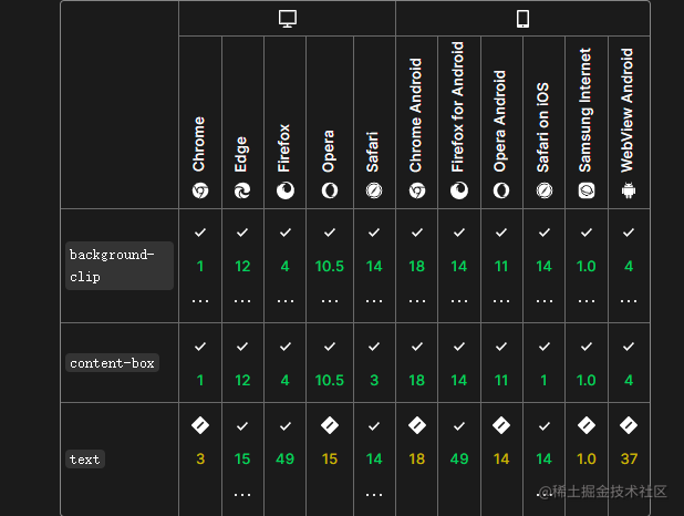
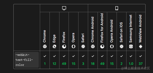
background-clip 属性定义元素的背景图片或背景色延伸到边框(border-box)、内边距(padding-box)或裁剪至内容区(content-box)。但是它还有一个值 text 可以将背景裁剪成文字的前景色,目前各浏览器 PC 端和移动端都已支持该值,chrome 中需要加 -webkit- 前缀。该值需要配合 -webkit-text-fill-color: transparent 将元素本身字体颜色隐藏,-webkit-text-fill-color 的优先级要大于 color,所以可以确保将颜色填充覆盖元素本身的颜色。
下面例子中,使用 linear-gradient 函数设置了背景图片,也可以使用图片格式的文件。
1
2
3
4
5
6
7
8
9
| <h1 class="rainbow">渐变色字体</h1>
<style>
.rainbow {
background: linear-gradient(to right, red, yellow, lime, aqua, blue, fuchsia) 0 / 50%;
background-clip: text;
-webkit-background-clip: text;
-webkit-text-fill-color: transparent;
}
</style>
|
使用动画
使用 filter 滤镜 hue-rotate 函数来动态改变元素内容的色调。
1
2
3
4
5
6
7
8
9
10
11
12
13
14
15
16
17
18
| <h1 class="rainbow">渐变色字体</h1>
<style>
.rainbow {
background: linear-gradient(to right, red, yellow, lime, aqua, blue, fuchsia) 0 / 50%;
background-clip: text;
-webkit-background-clip: text;
-webkit-text-fill-color: transparent;
animation: hue 6s infinite;
}
@keyframes hue {
from {
filter: hue-rotate(0deg);
}
to {
filter: hue-rotate(360deg);
}
}
</style>
|
